Diary of an Aspiring Card Maker
Tuesday 9 September 2014
Technique of the Week: Silhouettes
This week, I'm focusing on my silhouette cards. These are my go-to designs when I'm sometimes stuck for ideas. My first silhouette cards were a set of Christmas cards back when I was more focused on calligraphy than paper craft and featured different Christmassy shapes with a calligraphed message.
The original silhouette card: I was inspired by my magazine (again) and made this using black paper and finishing it with silver pen detail and white thread strings. I also learnt that day that stitching paper is not the easiest thing to do and vowed never to do it again. I lied. This is probably one of my favourite templates to use and the last card I made before moving also featured it (albeit the evolved version).
I make sure to always have a stash of black card or paper just in case I have the urge.
The key to a good silhouette card is to keep it simple. Because the card has no real detail, it needs to be distinguishable and it needs to be clear what the design is. From my own experience, I know how difficult it can be to judge - I know what it's meant to look like - so I usually borrow my brother or sister and get them to identify the design!
By using black, it lets me use a whole range of other colours. I found white in particular looks particularly bold. I always like to finish them off with a bit of sparkle by using a silver (or gold) pen and peel-offs.
These two cards used the off-cuts from each other. Anyone who knows the Death Note manga series will know who these two characters are. I was particularly pleased with them because they reflect the characters and their relationship with each other.
This one was a repeat of a card I made for a friend starting a new job. It's still one of my favourite designs because of the way the silhouette stands out against the pink and just makes the shoes pop. (I was particularly happy with the writing as well)
Tuesday 12 August 2014
Technique of the Week: Fonts
Sunday 10 August 2014
Relocated!
Tuesday 5 August 2014
Technique of the Week: Easel Cards
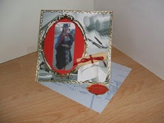
Last week, I received this card for my graduation. It was made by a family friend but sent from my Nanna. While I’ve seen easel cards several times in magazines and on websites and other blogs, I hadn’t actually come across one in real life. Easel cards never really seemed my kind of style, mainly due to all the borders and peel-offs and all sorts of embellishments and images, while mine tended to use paper piecing technique and a generally simpler design.
It’s not that often that I receive handmade cards so when I do, I like to examine every detail – how did they do that? what paper was used there? I’ve never done it like that before! – and this card was no exception. While I admit, it took me far longer than it should have for me to realise how the card worked (getting it to stand up), I was inspired by the simplicity of the structure and how effective it was. Cards like this are perfect for special occasions (significant birthdays, wedding anniversaries, weddings, graduation, etc.) because they are more than just a card and become a keepsake of sorts.
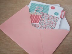
I decided to have a go at making an easel card and was surprised (although I really shouldn’t have been) at how easy it was to make. I chose to use a card blank that I already had rather than make it from card stock but all I had to do was trim it down to make it into a square blank and fold the front diagonally to make the easel. To make the front of the card, I cut a square of white card to match the size of my easel. The nice thing I found about using a card blank was that it had different colours on each side of the card and by turning the blank inside out, I could have a coloured base.
In honour of the Great British Bake Off starting tomorrow (who else is as excited as I am????), I chose to do a cupcake themed card. The papers were courtesy of Papercraft Inspirations (of course) and fitted my theme perfectly. Another great thing about using card blanks is that they come with matching envelopes, which saves me having to root through my ever growing pile of recycled envelopes trying to find one that is both the right size and colour. Because the card blank has been trimmed, it does leave space in the envelope but this can be taken advantage of by not restricting the design of the card to the dimensions of the front – I added a little tab as a final flourish.
Having seen for myself how simple these cards are to make and having a few more special occasions coming along soon, I will no doubt be giving easel cards another go in the near future.
Tuesday 29 July 2014
Technique of the Week: Paper piecing
This week, I’m sharing my favourite technique, or at least the one I use the most often: Paper piecing. If my favourite magazine is anything to go by, its quite a popular one in the world of card making but I particularly enjoy it as it allows me to combine my sketching and drawing with my paper craft and gives me freedom to create my own designs and styles. It’s also a great way to use up scraps of paper!
I tend to use my own sketches at templates but I do occasionally use existing ones so its no biggie if you aren’t as skilled with a pencil. This post however is going to go through my process from sketchbook to greetings card.
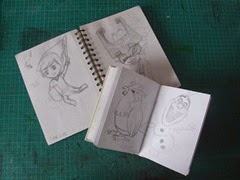
The first thing I do is sketch out my design. I have a small sketchbook especially for my card making where I can jot down a new idea or sketch out a design. My book is A6 which means that even if I fill the page, it will still fit onto the front of my preferred size of card blank. It also means I can actually draft out a full design. (I’d love to say it was planned that way but unfortunately it was just a happy coincidence). I do occasionally use bigger sketchbooks.
Once I’m happy with my design (and this can take a couple of attempts and quite a while depending on how carried away I get with the sketching. I have been known to completely finish and shade in with extra details before now), I get out my trusty tracing paper. As an architecture student, I used this almost as much as normal paper so I always had some lying around whether a clean sheet or an old drawing or even just scraps. I then trace over the line drawing, not necessarily in very much detail – some things can be added in free-hand later.
With the basic template done, it’s time to start transferring the different shapes onto coloured paper. I flip the trace over so that the design is reversed. This is for two reasons. The first, so that I can transfer the design simply by drawing over the template again; the second, so that pencil marks will be on the back of the paper and out of sight without me having to rub them out. When tracing the shapes onto paper, I make sure to leave a little extra in order to glue the layers together, occasionally using on piece for a couple of sections – here, the face and the ear were one piece, with the hair placed on top. Once all the pieces are cut out, the picture can be assembled (this bit can be a bit messy!)
To finish off my paper piecings, I add detail with a black pen. This depends on the style I’m going for and can range from simply outlines to more detailed shading.
While I tend to keep the more detailed ones for the frames, simpler designs are great for greetings cards. This Iron Man birthday card was made with very few different shapes. The hand was stuck on using foam pads to give the design some depth but all of the detail was done with black pen and a sharpened white pencil in order to mimic the comic book style.
In contrast to this, the Suits themed birthday card focused on mainly the silhouette of the character, with very little detail added to the hair. I was unsure how obvious this design would be to the recipient but as she is an avid Suits fan, she understood the reference immediately (phew!).
Would love to know what you think of my Technique of the Week posts so leave a comment below! Any suggestions for future posts more than welcome!
Happy 100th Post!
Although I will be posting my new weekly entry later this evening, I wanted to do something a bit more special for my 100th post, so here we are.
Nearly two and a half years ago I manned my first table selling my cards at my hall of residence's fundraiser and not long after that I sat down and wrote my first post (I'm still slightly in awe that I managed to stick with it!).
This blog was started to share my makes and ideas and to record my progress of starting a small business so it makes sense to look back on the last 100 posts and to see how far I've come.
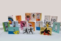
2012 not only saw the start of my blog but also of the London Olympic Games. I loved taking part in my own “Card-lympics” (even more so when I Googled the phrase!) and although a fair few of them have been sold, I’ve still got a small handful of them (I was very reluctant to let any of them go to begin with!)
In August I got a mention in Papercraft Inspirations, the magazine I read, when they published one of my cards from my blog. I was particularly pleased with that card and have since made it at least once. I was thrilled to see my card in my favourite mag.
October saw me making my first ever paper-pieced picture, inspired from one of my cards. I figured I should trial my idea and keep the first one for myself. The 10th Doctor still sits on my desk and will definitely be coming with me to Bath. Since that first one, I’ve made Alice in Wonderland, Marvin, Pokemon and Jane Austen. I should really start making those again soon . . .
These were a big hit when I attended my first craft fair at Victoria Baths in Manchester. Despite the cold, I had a great time although I’m pretty sure most of that was down to the fact that I had a really successful day. I hope to one day repeat that success as none of the events I’ve done since then have even come close.
Six months on was Victoria Baths II and although it wasn’t as successful, it was much warmer and really interesting to see how far I’d come in that time. By this point, I had a whole table to myself and managed to fill it!.
In September, I started taking my cards to the next dimension and am still experimenting with new 3D shaped card – I even have a new one to try out soon! While I’ve had a go at all sorts of shapes, there are a couple that I keep going back to. If I had to pick a favourite, I think it would be my hiking ones.
Over the last nine-ish months, I’ll admit, my cards (and my blog) got rudely pushed to the side in order for me to concentrate on my final year at uni. It wasn’t necessarily intentional, I just didn’t have time to do both and no good enough excuses to spend an evening aimlessly making cards. However, now that I have finished uni for now (and with a 2:1 to boot!), I can get back to card making with a vengeance and last week saw my first Technique of the Week, a series that is going to make me publish at least once a week but hopefully will challenge my blogging and give it more of a purpose.
While I am now back in North Wales, I won’t be seeing Manchester again for a while and this time in two weeks, I’ll be down South in the city Miss Austen herself lived in. A new location and a new job with regular hours mean plenty of new opportunities for me and my cards. Here’s to the next 100!
Tuesday 22 July 2014
Technique of the Week: Tassels
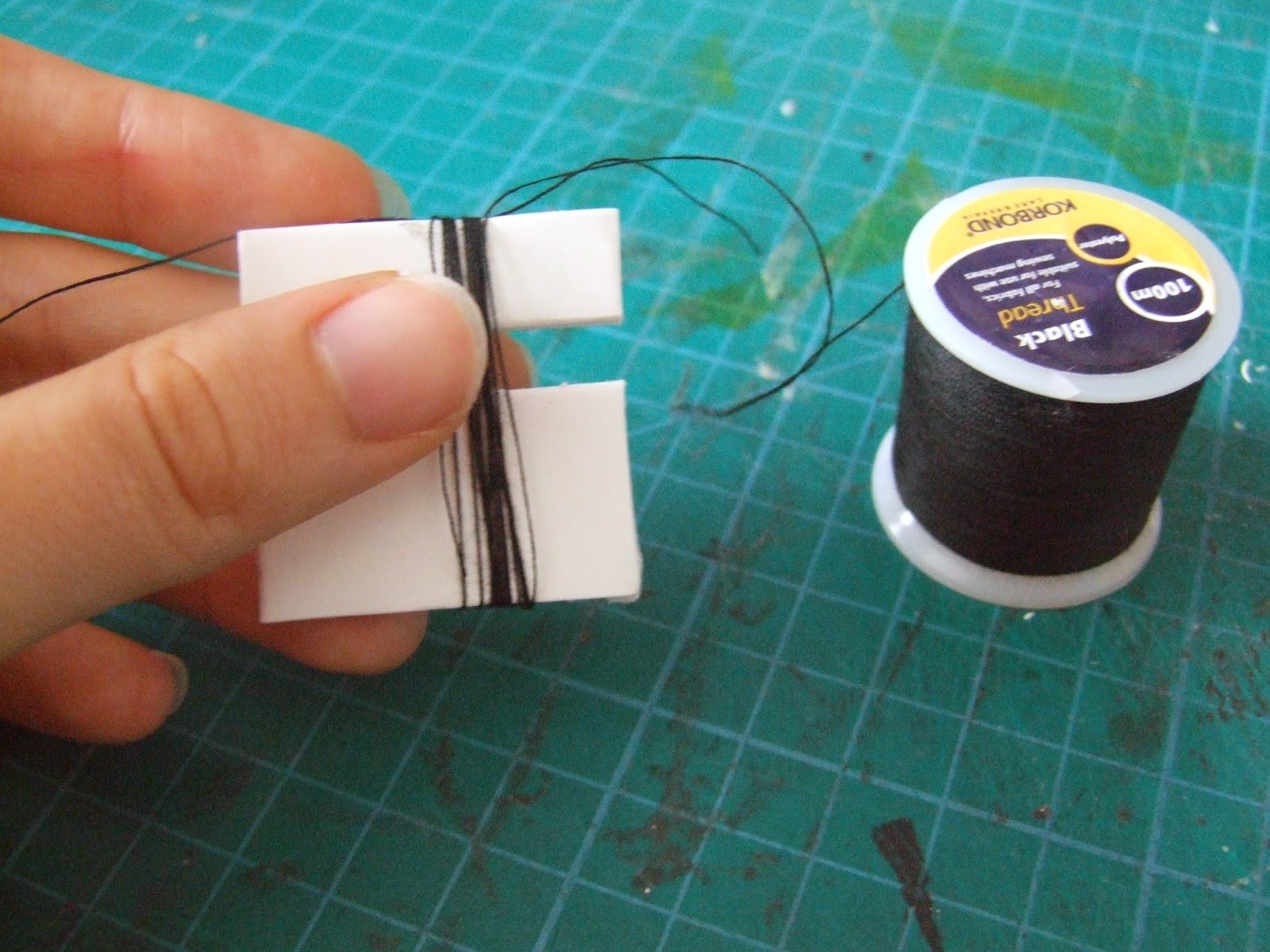
- Some thread/string/wool. I used black thread for mine as they were only going to be small but obviously, to make bigger tassels, you would use a thicker material.
- A piece of cardboard. My tutorial uses foam board as clever me had a clear out earlier in the week and this was all I could find. Cardboard would work better but essentially you need something that is thin and stiff. The size of the cardboard will determine the size of the tassel.
- Scissors.
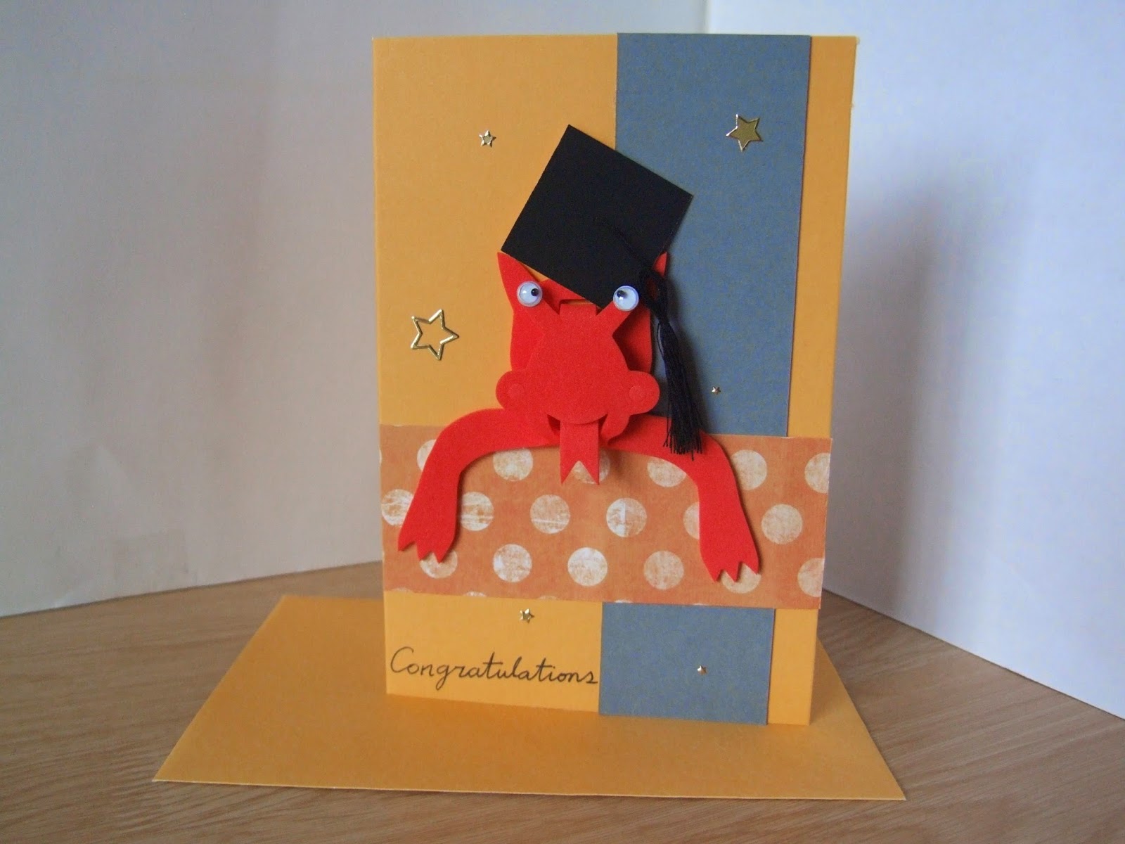
Three tassels made three caps for three cards. I chose to use my school colours as we are part of two universities. I didn't want to make three identical cards which also let me try out different ways to place the cap.
Having the owl throw it up in celebration was a very simple way to us it: the tassel doesn't need arranging or sticking down.
The second card was for a fellow Welshman, and having found this foam dragon in my stash, it was just crying out to be used. I should have however, trimmed the cap down to compensate for the foreshortening (see the third card). The other thing to remember when actually putting the cap onto a figure is to stick the tassel down - otherwise it'll get in the way! Although it would kind of fit in with this goofy looking dragon.
The third card is probably the most traditional of the three. I added a bit of glue to keep the tassel off to the side. This card was also embellished with a degree scroll. This was simply made by rolling a bit of white paper around the end of a paint brush, using glue to seal the end of the strip. To finished I used a bit of red thread to tie a bow around it and flattened the scroll slightly so that it adhered to the card front easily.