Showing posts with label silhouette. Show all posts

Tuesday, 9 September 2014

Technique of the Week: Silhouettes

Due to the faff of a new city, new job, new flat and a new routine, my new blog posts have suffered. I aim to do better.

This week, I'm focusing on my silhouette cards. These are my go-to designs when I'm sometimes stuck for ideas. My first silhouette cards were a set of Christmas cards back when I was more focused on calligraphy than paper craft and featured different Christmassy shapes with a calligraphed message.


The original silhouette card: I was inspired by my magazine (again) and made this using black paper and finishing it with silver pen detail and white thread strings. I also learnt that day that stitching paper is not the easiest thing to do and vowed never to do it again. I lied. This is probably one of my favourite templates to use and the last card I made before moving also featured it (albeit the evolved version).


I make sure to always have a stash of black card or paper just in case I have the urge.

The key to a good silhouette card is to keep it simple. Because the card has no real detail, it needs to be distinguishable and it needs to be clear what the design is. From my own experience, I know how difficult it can be to judge - I know what it's meant to look like - so I usually borrow my brother or sister and get them to identify the design!
By using black, it lets me use a whole range of other colours. I found white in particular looks particularly bold. I always like to finish them off with a bit of sparkle by using a silver (or gold) pen and peel-offs. 

These two cards used the off-cuts from each other. Anyone who knows the Death Note manga series will know who these two characters are. I was particularly pleased with them because they reflect the characters and their relationship with each other.


This one was a repeat of a card I made for a friend starting a new job. It's still one of my favourite designs because of the way the silhouette stands out against the pink and just makes the shoes pop. (I was particularly happy with the writing as well)

Monday, 30 December 2013

A Card for a Potterhead

Having just blogged about my hiking birthday card, and my Wicked birthday card for that matter, I realised that I completely forgot to write about my sister's birthday card back in October. To call her a bit of a Potterhead would be the understatement of 2013.


Some of the inspiration for this card came from a small business called Paper Panda who makes the most intricate paper cuttings and I thought I'd give it a go. 
I used a zig-zag card again, with the back of the card a silhouette of Hogwarts. I used my sneaky powers of detection to find out which house she was in and made this the colour scheme of the card, as well as providing the design for the central fold. 
Like with my Wicked card, I was running short of ideas so for the front, along with the sorting hat and a birthday sentiment, I went crazy with a few stars.

My favourite bit is definitely the silhouette. I'm really pleased with it but it was hard going although I can now say that I've done it and I really do know how much work goes into what Paper Panda produces - and mine isn't even anywhere near the scale her work is on! I may do more paper cutting in the future but I definitely think that paper piecing is my thing.

Wednesday, 12 December 2012

Paper Pieced Pictures: Past, Present, Future

In this post, I wanted to write about my paper pictures. I realise that I have mentioned them several times before but wanted to give them a proper entry seeing as I am making quite a few of them these days.


So, first up was of course, the best Doctor ever to travel through time and space. I think I was actually watching the most recent Weeping Angels episode when I was putting this one together! I really do love this one and the black pen makes it look as if he's just stepped out of the glossy pages of a comic book. I now have several jealous friends but I feel it is my duty to keep the first - and tester - one. I tried to layer everything in this one so each part of the suit is on a different layer to really make it stand out from the frame.


My second was a birthday present for my room mate who would probably be Mrs Jack Skellington, if only he was real! I took ages drawing him out in my sketchbook - not because it was laborious, just because I didn't know when to stop shading! I remember I messed up slightly with his tie - I think I got the layers mixed up a bit - and I could have done more to stick it down firmly but I am happy with him. White pencil on black card will always be something that I enjoy doing and the look is so effective. I probably should have done him a little bit smaller so I didn't have to squash Zero into the top corner.


Iron Man was on my list nearly from the beginning. This one was based on the comic book character although the original inspiration came from the films (Who wouldn't be inspired by RDJ!). Honestly, I'm not overly happy with it. I just couldn't get his shape right but, again, love the black pen detail. I remember this one being quite fiddly to do because of the yellow parts fitting in to the red but the starry paper background really finishes it off. This frame was one of the four that were made for the Victoria Baths craft fair and one of the two that were sold. I may have to make this one again and, now that I have seen The Avengers and Iron Man 3 and The Avengers 2 coming out in the new year, I will have to have a go at some of the other characters . . . . 


Alice in Wonderland has been a running theme throughout my crafts this year, possibly because it being Jubilee year and Alice and Tea Parties being quintessentially British or because of the amount of artistic licence, either way, it is probably one of my favourite themes. These two frames, like Iron Man, were made for the Victoria Baths craft fair. I was inspired by the original illustrations from the book but I didn't want to just copy them. A few years back, I got some Kate Knight papers which were absolutely perfect for this project. The bright and almost garish colours and patterns were definitely Wonderland-esque while I was able to use some more toned down colours for Alice herself. Again, my black pen makes an appearance to add the final details.

I used a bit of recycling in the Cheshire Cat picture; the tree was made out of the paper that filled the frame when I first bought it - fun fact #1!
Fun fact #2: For the Caterpillar's shisha pipe, I used thread, wrapping it all around the picture. It was a bit of a pain to do but the best way to do it and it gives a nice finishing touch I think.
My sister, who funnily enough is also named Alice (all the jokes have already been done!), was eyeing up the Cheshire Cat picture before it was sold at the fair. Sorry, Alice!


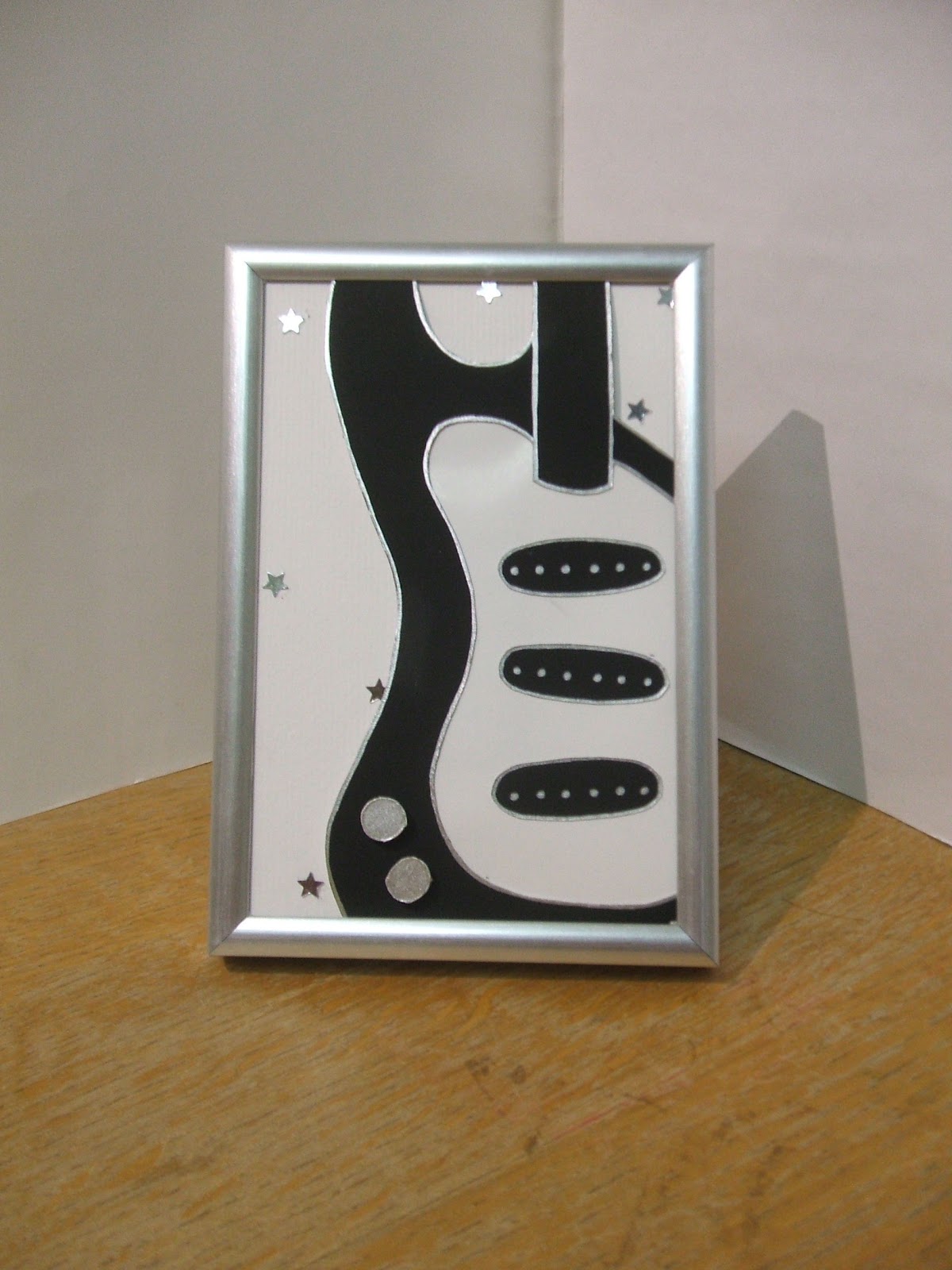
I couldn't very well leave my guitar silhouettes out of the picture - no pun intended - so I picked myself up a smaller frame and had a go. Using silver with the black and white works so well and maybe once I manage to sell this one, I'll make another!


My Jane Austen designs are my most recent and I hope to make some more of these. The first one I made featured a quote, which just happens to be one of my favourites, from Pride and Prejudice. These were a bit different from my original frames as they aren't layers as such, just decorated. I felt that I couldn't really do any novel for my second one other than Emma and I admit I did have to look up the quote on-line - but only because I don't have my books with me! (excuses, excuses, I hear you say) My next step with these is to work on my font, maybe even get out the ol' calligraphy set, and get a list of suitable quotes written down.

The last one I want to talk about can't really be talked about so shhhh! This one is my first commissioned piece so it's all very exciting but I can't really say more than that. Here's a picture though to get you thinking, but if you know what it is, don't say anything!


I still have plenty of ideas to be put down into paper and I think I will be having a go at some of these in the new year but because I'm such an awesome person, I am going to give you some ideas of what you'll be seeing soon.

More period costumes. Computer game heroes. Pie makers. Paranoid Androids. Steam-punk  Nerdy roommates.

Tuesday, 16 October 2012

The Card Maker's Birthday

Yes, that's right. Today I enter my third decade (feel old not being a teen any more) . But, I have now booked my craft fair so all that is left to do is to make sure I have plenty of stock ready but that shouldn't be too much of a problem. I did a recent count and I have about 150 cards just lying around although, I haven't done much crafting since I last posted. With this one exception . . . 

Yesterday saw my room mate's birthday and as I am still experimenting with my paper-pieced pictures, I decided to make one for her. 
If you can't tell by the photo, she is a BIG fan of The Nightmare Before Christmas, with Jack Skellington being her Halloween costume this year as well. I used the same sized frame as my Doctor Who one but was able to get it in black (which looks so much better!). I got a bit carried away with my rough sketch and ended up shading it properly but it gave me a template to work with.
To make his pinstriped suit, I used black card and drew the stripes on with a sharp white pencil. I sketched on his mouth and skeletal hand details with black pen but to add a bit of depth, I cut the eyes and nose out and glued some black card behind them. I did a similar thing with his bat bowtie although next time I make him, I don't think I will make it stand out so much as it did get a little bit damaged in transit.
I couldn't give her a present without a card so I made one to match. Originally, I was going to do a similar design on an orange card blank but I couldn't resist the black and purple combo. I am really pleased with the card and as a finishing touch, I had to add a Tim Burton-esque flourish on the envelope.

Sunday, 2 September 2012

Exciting News

So, in my last post I mentioned having some exciting news. Well, I couldn't wait any longer to share so here it is.


A while back, whilst doing my card-lympics, I tweeted to my favourite magazine about them. A little later that day I received an e-mail from them saying that they wanted to feature my blog in the magazine on their blog feature page and wanted a photo of my card. This was one that I made for a very close family friend who loved shoes and was starting a new job. 
I was sent a proof copy of the article (which is what this is from) but I now have the actual magazine. With my card in! Still not quite come down to Earth yet! 6 months ago I barely had a Facebook page for my cards, let alone a blog and now I'm appearing in my favourite magazine!

Told you it was exciting!

Tuesday, 14 August 2012

Youth Culture Cards

I think I am still recovering from the last two weeks, although I think it's more the lack of sport than having had to make and post a card everyday, from Wimbledon to le Tour de France to the Olympics, I've been watching sport for the last two months! 

Anyway.

Recently, I decided on my target market, although I won't stop with all my other cards! Whilst I was at the Kanzi Kibera concert in July, one of my customers (that sound good!) was commenting that we didn't have many cards for teenage boys - luckily I had a couple of my silhouette guitar cards with me. 
That got me thinking a bit. Most of the handmade cards that I have seen are quite fancy and grown up, or brightly coloured and childish and mainly aimed at the female market. 
So, bearing this in mind, I set up an album on my Facebook page dedicated especially to those cards aimed at young people. These designs range from Batman to Disney to guitars and over the last couple of years this collection has grown quite a bit. I guess it helps that I am off that age group where all my friends fit into this category. I hope to expand this and I was able to add some more to the album today.
Last month, my brother requested a meme card for his friend's birthday. This proved to be a bit of a challenge for a couple of reasons. 1, his friend had already seen my first meme card - 'Like a Sir' (posted in April) so I couldn't give him that one and 2, I don't know that much about memes so I had to come up with a design that used the right meme in the right way (or else I would be in BIG trouble!).
I finally came up with my design:


This 'rage comic' as they are called comes with the caption 'Challenge Accepted' and of course, he is referring to the giant paper pieced birthday cake next to him. I believe it went down well and I think my reputation precedes me now. Whenever it's one of my brother's friend's birthdays (and he asks for one of my cards) as soon as he gives it to them, they say - before even opening it might I add - 'this is one of Emma's cards isn't it?' 

The other cards added to the album were hot off the cutting mat today. I have been reading a manga called Death Note. I began reading it last year but put it down and have only begun to read it again. It's quite thought provoking but is so, so good although you do have to pay close attention in order to follow the logic of the characters.
The two main characters, Raito and 'L' (he doesn't share his real name in the book) work together in order to solve a huge mass murdering mystery. However, we know from the beginning that Raito is the one that has been causing the deaths and wants rid of L. 
And this is where the inspiration came from. The main themes in the book are a bit of a Ying and Yang. The obvious one is good vs evil.


The design on these cards are silhouettes of Raito and L face to face. Those who are familiar with the manga, anime or film can (hopefully) see who is who and the significance of the apple in the middle (I don't want to go into too much detail about the story). The apple was made with red card and finished with black pen and white pencil to add detail such as shine and shadow.
I am really happy with these card, and I will probably end up making a template from the two silhouettes to make more of these cards (if needed). Once I had drawn the profiles - using the manga as reference - it was simply a case of cutting them out and sticking them in place and because I cut them out carefully, I was able to use the negatives to create a second card.

Sunday, 12 August 2012

Card-lympics Day 17

Here it is, the final day of the Olympics and therefore my Card-lympics. It has really flown by and Britain have done so well! Well exceeding their medal target of 48 (though I am still rooting for that 65th medal to be our 30th gold - it ain't over until the Closing Ceremony!)
It also seems appropriate that this will be my 40th post on my blog! and I reached 1000 views today as well.


I have to admit that when I was planning my card-lympics, I miss calculated. The games are on for 16 days. So I decided to make 16 cards. However, I started on the day of the Opening Ceremony, which wasn't among that 16 so, as you can see, I have made 17 cards. I didn't design this one along with the others and had decide on my sport and what I was going to do only this morning.


I chose to do athletics, although any of the running events could be represented by this card. I chose to do it because of athletics being probably the major event of the games and also because of Team GB's success in the stadium over the last couple of weeks: Jessica Ennis, Mo Farah and Greg Rutherford - and they are just the gold medals! So athletics was to be my final event.


Once again, I opted for a silhouette card with paper pieced detail. I created the silhouette of the runner crossing the finishing line and added a paper Team GB kit, finishing it with the Union Flag, similar to last night's card. I wanted to give an extra sense of the winning by adding a ribbon (although that's a bit more Marathon than stadium but like I said, any running event) across his front. When designing it I had a cross between Mo Farah and a marathon runner in my head so its a bit of a mish-mash but I realised that I hadn't actually made a 'winning' card and felt after the success we have had this year, I needed one to finish.


After I had finished, I got them all together and with help from my dad, some boxes and a white table cloth, got a massive team photo.


And now for the medals . . . . .

My three favourite cards are:


In Bronze: Basketball - The bold design worked so well as did it's fairly minimalist approach.
In Silver: Cycling - It had to be Wiggins! I love the silhouettes in the background and the cycling kit gives me plenty of inspiration for more cards.
In Gold: Judo - I realise how biased it is but I love this card so much, the amount of effort I put into it was ridiculous for what it is but it works so so well and almost has a hint of Japanese in it.


I would love to hear what you think and which ones you would give Gold, Silver and Bronze and I hope any of you who did follow my Card-lympics enjoyed and have been inspired.

Card-lympics Day 16

I am cutting this really close to the line as I make my second to last Olympics card. I was busy watching Tom Daley win his bronze medal.

Today the event was cycling and one that I have been looking forward to doing for a while. I started watching le Tour de France so was also watching it this year and saw Bradley Wiggins be the first Brit to ever win so for me, when I think cycling, I think Wiggins and naturally he had to be the focus of this card. But I also went off at a slight tangent and featured le Tour in the card also.
I realised that there were many ways which this card design could have gone, and I shall be trying some of these in the near future. However, I think I tried to get a bit of everything into this card.

Again, this was mainly a paper pieced project with a bit of silhouette thrown in. I used black paper for the bike and finished it with black pen spokes. For the cycling kit, the maillot jaune, I used yellow paper and again finished it with black pen and the Union Flag for some British pride and as a final final finishing touch, I had to add those now iconic sideburns!


Wednesday, 8 August 2012

Card-lympics Day 13

After our recent success at Greenwich, this card seems fairly apt. I had to rely on the BBC for a photo of the show jumping, although unfortunately it was one from the article about Nick Skelton missing out on a medal today. I guess it would be unfair if we won all of them!
Again, I opted for a silhouette card, but can you blame me? I didn't really want to paper piece a horse and its rider and getting the horse right was hard enough so I went for the shadows. I used dark orange paper to create the fence and added dimension to the card by raising the horse and front post on foam pads while simply gluing the rear post and fence to the card blank.
I felt this design was a more general design, in that this card could go to anyone who likes horses etc. whereas one of my other ones, say, the triathlon, is fairly specific. I could have left it with the figure but I decided to add a birthday peel-off. It's one that I had been looking to get rid off as it's not the style I would use at all but I think it really works well with this card, all the fences, and the whole arena for that matter, are decorated with lots of flowers and it just seemed to fit in.
I was also able to integrate the Union Flag into the design once again. Recently I've just had to stick it in the corner or somewhere neat as it didn't fit in with the image on the card but adding it to the fence post looks alright and seen as all the fencing at Greenwich are English themed, I figured I could get away with it!


Sunday, 5 August 2012

Card-lympics Day 10

We are well over half way through the Olympics now. Yesterday, now known as Super Saturday, was absolutely amazing! Three British gold medals in the space of 45 minutes and a couple more today, courtesy of Ben Ainslie and Andy Murray. We are on a roll!


Today's sport was hockey, field hockey to be more specific, and seeing as I hadn't played hockey since I was probably in year 8, my inspiration left much to be desired. My obvious design was the stick and ball and that's what I stuck with. I tried to make it a bit more interesting by adding some patterned paper as a background and finishing it off with a peel-off message but it's certainly not my best card-lympics entry.
The stick and ball were cut out from black card and outlined with gold pen, just to give it a bit extra.
Maybe tomorrow I won't leave it so late and give my creative juices time to flow properly.


Monday, 30 July 2012

Card-lympics Day 4

It's that time again and I would have posted a bit earlier but I stopped to watch the diving (gutted for Team GB). 

Today's theme is gymnastics and, like yesterday's card, I knew exactly what I wanted it to look like. I have always loved watching the gymnastics and especially the floor work but the image I had for my card fits into the rhythmic gymnastics, another one which I will be watching. 
Like my fencing card, I created a silhouette figure but added more movement to it by added ribbon, attached at only the ends, and attaching the figure to the card using foam pads. Pink seemed the obvious colour to chose (maybe because rhythmic gymnastics is a women's sport or because of the venue colours, I don't know) but the only ribbon I had was too close a shade to the card for my liking so I added some darker pink handmade paper and finished my card with stars (for all the glitz and glitter of the event) and my Union Flag tag.

I considered added a coloured leotard to the figure but I had difficulty choosing the right colour: Team GB colours would probably clash with the pink and if I chose another colour, it could show support for another team (and we can't have that! =P) and may be a bit too much pink. So I left it black.


On a related topic - Good luck to the Team GB Gymnastics lads tonight!!  

Sunday, 29 July 2012

Card-lympics Day 3

Today's theme was a sport which I have had a go at and really enjoyed: Fencing. I felt there was only one design for this card and that was a silhouette. In a way, its almost a negative of the colours of the actual sport: the white suit swapped for black and, after watching it yesterday and today in the Olympics, a black background changing to a white.


When I first thought about today's card, as well as knowing it was going to be a silhouette card, I knew it had to have one of the players lunging and scoring with the foil (the weapon I leant).


The making of the card, once I had drawn out my design was so simple it hardly needs an explanation: black card silhouette glued onto the card blank and finished with my ProMarker Union Jack.


Tuesday, 10 July 2012

Kanzi Kibera

I guess it's about time that I wrote about last weekend's festivities. The evening overall was a great success and lots of money was raised for the charity although we didn't seem to sell many cards (despite the 100 I had made and the however many that Carole made)
I want to share some of the cards that I made for the gig. Not all of them, mind you, we'd be here all night!
 I began designing after I came across Some Odd Girl, a company that make stamps and digi stamps. If you have the chance, take a look; they are so cute! I've always enjoyed drawing manga and after looking at these stamps, I started doing my own. This one was one of my first designs (Wimbledon was on at the time) and after I was happy with my sketch, I scanned it into the computer and painted it using Photoshop. I was then able to print out multiple images to put on cards. I also wrote the message on the computer. I made six in total, on different colour card blanks.


As I mentioned in one of my previous posts, I had a go at making some more cards with tea-bag folded embellishments. This one is my favourite of the ten I made. I like the colour and using the square that are too small to fold (believe me I tried!) are so effective and they make sure I don't waste any of my stash. I finished off the card with a peel-off message and a length of ribbon.


This next card was made with gifts from my Japanese friend from university. As a leaving present (she was only spending one year in the UK), she gave me so beautiful origami papers especially to make cards with. She also gave me a brush tipped pen, which is what I used to write the message. The papers were perfect to make kimonos out of and I made four of these by mixing and matching.
I decided to make some more of my silhouette cards for the fundraiser mainly because they are simple to make and replicate and the design is really striking. So striking in fact that I sold both of the guitar cards to one person who was after a card for a teenage birthday (and so I found my niche, but more on that later). I also made some camera silhouettes, a couple of them on coloured card blanks. 


Finally, I want to show you my second set of my manga cards (I should probably come up with a name for them or something). These were inspired by the gig: being a musical event, what better design to have than a musician? I did these the same was as the tennis ones: sketch, scan, paint, print. I finished this set of six by backing them with red rose patterned vellum and a stamped message. I am going to stick with these characters and I have already started on my next batch of characters with a new theme . . . . watch this space!

Monday, 2 July 2012

Busy Weekend

This weekend saw me making plenty of cards for various occasions, including my first proper order - my brother was talking about my cards to one of his friends who needed one for her mum's birthday later this week. The theme for this card was The Cat in the Hat.
I began by looking at the character on-line and sketching out some ideas. I decided to make (yet another) silhouette card but highlight his famous hat and bow-tie.
To make it, I drew out my cat onto black card and finished it off by adding a red and white paper hat (and tie) with pen detail. 
I finished the card with silver stars and a happy birthday foam sticker.

After I had shown it to mum, she wanted one for her boss' birthday, her boss who happens to like cats. This one was more or less the same, with small changes in the details.


My third card of the weekend was a new baby card for our brand new family member (a distant relation). This one required a bit of inspiration. I finally came across the perfect template.

I used some pink and cream spotted paper for the rabbit, finishing it off with a little pink ribbon and pen features. The card itself was decorated with a strip of cream ribbon and some pink gingham tape with a 'congratulations' foam sticker (there is a lack of 'new baby' or 'baby girl/boy' stickers in my stash).


My other creation was for a family friend who was starting a new job. This was a new theme for me, having never made a 'good luck on your new job' card before. So I hit my magazines once more. Unfortunately, they were limited and all included stationary or shirts and ties which wasn't what I was looking for. I did have one idea though and that was shoes. My friend, Jan, absolutely adores shoes, so I decided to make them the focus of the design.
Again, I chose to do a silhouette card but used brightly coloured paper from the Retro Rose range for the shoes and detail on the card. I am so happy with the design and love the colours. I think it definitely ranks up there with my favourite makes. I used Word to help me write the message, but typing it out, finding the right font and copying it onto the card. I didn't just want to write good luck but I was able to come up with this sentiment, which I thought matched my card perfectly.